I recently moved to Durham, NC to start my graduate studies at Duke University. My family has been in Raleigh for the past 10 years, and I actually went to high school in Durham, so it’s nice to be back in the area.
A lot has changed since my time here in high school, primarily due to the huge growth in the Research Triangle Park (RTP) area. As businesses came to the area, workers followed and the population grew dramatically. Now the area near my old high school in Durham is hardly recognizable, for new restaurants, grocery stores, and shops have all taken residence in the nearby streets.
](https://cdn-images-1.medium.com/max/2000/1*6KjyiBza-tIFdR9KHwpfug.jpeg) Durham, NC. Photo: https://durhamnc.gov/3229/City-of-Durham-Brand-Guide
Durham, NC. Photo: https://durhamnc.gov/3229/City-of-Durham-Brand-Guide
Globally, a lot has happened in the last 10 years too, and one of them has been at the top of my mind as Hurricane Florence is making her way out of NC. Unusual temperature changes, natural disasters, and other environmental indicators have stirred up talk about climate change, although the causal inference is still unclear (as talked about in this Bloomberg piece). It’s become a politically charged topic, and what I tend to do in situations like this is turn to the data and see what we can find.
I decided to look at weather data collected on Durham in the past 11 years. The data I found was hosted and collected by the National Centers for Environmental Information, which has a great archive of data called Climate Data Online (CDO) that can be used to analyze historical trends. The data that is available is dependent upon the stations in the area of interest, but luckily there is a station in Durham that has data from 2007 to current, so I was able to download this data and import it into Python.
These are the available columns in the dataset:
Station ID: Station Identification Code (17 characters)
Name: Name of station. Usually city/airport name (max 50 characters)
Latitude: Decimated degrees w/northern > 0, southern < 0** **Longitude: Decimated degrees w/western > 0, eastern < 0
Elevation: Elevation about mean sea level, tenths of meters
Date: YYYYMMDD
Precipitation: Precipitation in inches to hundredths degree
Min Temp: Minimum temperature for day, Fahrenheit to tenths degree
Max Temp: Maximum temperature for day, Fahrenheit to tenths degree** Documentation available here.
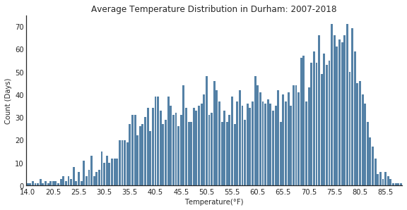
We can start with some simple exploration of the data using Seaborn for visualization. Let’s start by plotting the minimum temperature distribution for our time period.
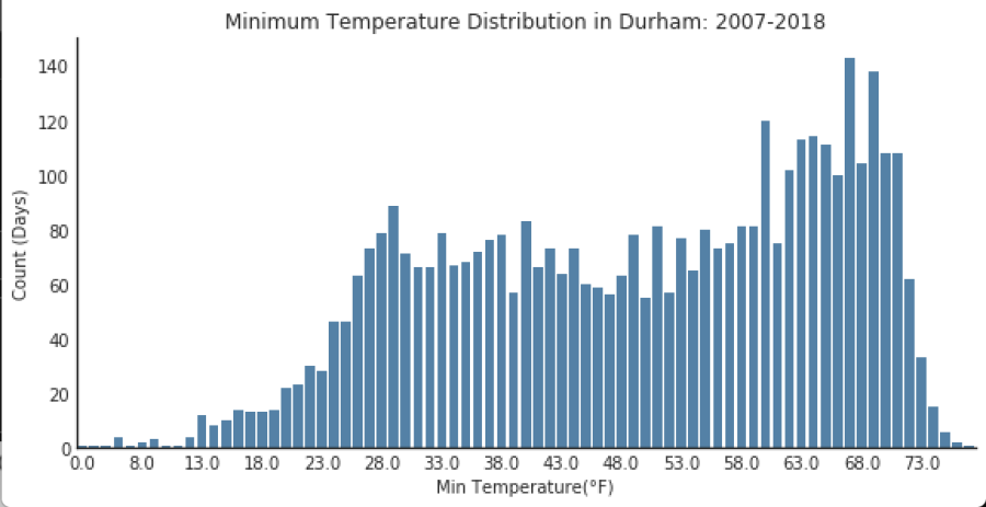
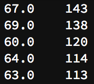
Below are the 5 most frequent minimum temperatures in Durham during our time period.
Temperature (°F) Count
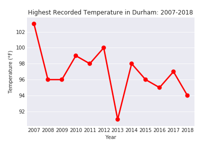
Overall minimum temperature: 0℉ We can do the same for maximum temperatures in Durham.

5 Most Frequent Maximum Temperatures
Temperature (°F) Count
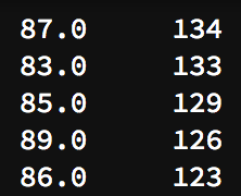
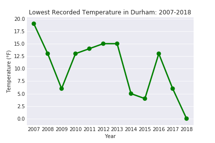
Overall maximum temperature: 103°F Since we have about 11 years of data, we can also look at these variables over time, which can give us an idea about the temperature trends in Durham. As seen below, I created plots for the lowest recorded temperature per year and highest recorded temperature per year.
We don’t have information about the average temperature per day, but I chose to calculate it by averaging the maximum and minimum temperature per day. This isn’t a true definition, but with the dataset that we have, I thought that I would give it a shot and see what I find.
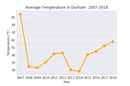
Considering the variability in the data, we can see that there has been a slight increase in average temperature in Durham during recent years. 2007 had the highest overall average temperature for our time period, but this decreased significantly the following year. Again, this isn’t the best way to calculate average temperature, but it does give us some insight into how the weather has trended during this time period.
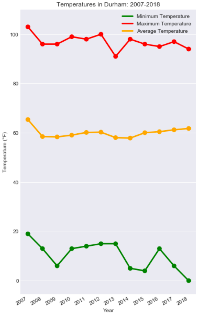
I wanted to have all of this information in one graph so that it easy for somebody to digest, so I created that and displayed it below.
Lastly, I decided to look at the precipitation values. The daily values don’t tell us much, but I summed the values to get a view of total precipitation per year.
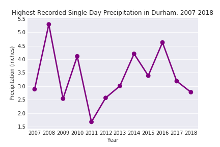
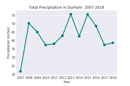
Of course, this data was collected pre-Hurricane Florence, so the 2018 datapoint isn’t exactly up-to-date.
With that, I’ll finish up my analysis of the weather dataset for now, but there’s a lot more that I can do with this dataset. Some of my further research questions include:
-
How does this data align with national weather trends? This obviously changes depending upon climate and area, but it would be interesting to compare Durham to other cities.
-
How about globally? Are global patterns in sync with the trends in Durham, or are there differences that tell us something about the environmental factors?
-
Are there other datasets that we can merge with this to gain more insight into weather effects?
-
Could we try training a model on this data and predict the max temperature, min temperature, and precipitation levels for the future?
My notebook for this analysis is posted on my Github:
https://github.com/vkumaresan/Open-Data/blob/master/Weather%20Analysis.ipynb
Originally published at http://datainallthings.wordpress.com on September 19, 2018.